Moving Head Exhibit

A little history
I’ve been ruminating on the idea for this exhibit since I was a child. My father is both an engineer and a lighting designer, and from him I picked up a deep interests in both. I was fascinated with automated lighting fixtures. Much more than a lamp in a can, these devices could change color, project patterns, create wild animated effects, and move around. How this was all accomplished became a mystery I spent much time unfolding.
At the time, these devices were extremely expensive, and used exclusively by experts... definitely not 11 year olds! While today they are not nearly as mysterious or rare, the ability for young children to look at, play with, and understand how these devices work is still difficult. Most people don’t want to dismantle their expensive lighting equipment just so someone can see inside.
When the local science museum started plans to remodel and expand, I decided the time and place was right to build one of the fixtures into an exhibit for all to learn from. An exhibit I would have been in love with as a child.
Design
The exhibit was destined for the Lancaster Science Factory. Their proximity to Rock Lititz meant they already had a number of stage related exhibits. This provided the perfect environment for my moving head exhibit. The lighting fixture chosen was a small LED moving head (Chauvet Intimidator Spot 260).
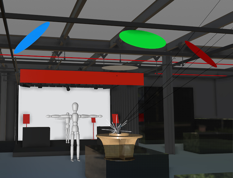
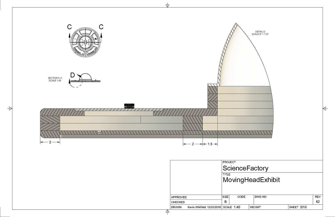
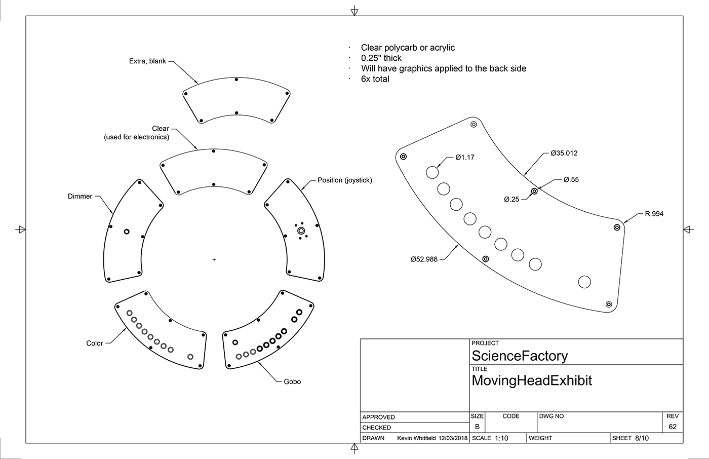
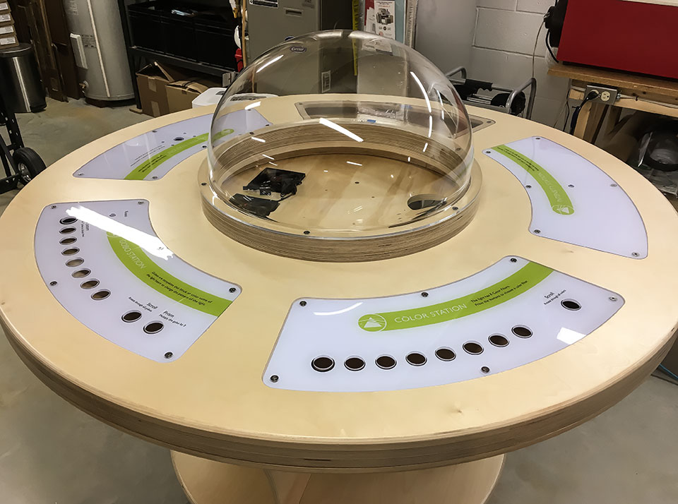
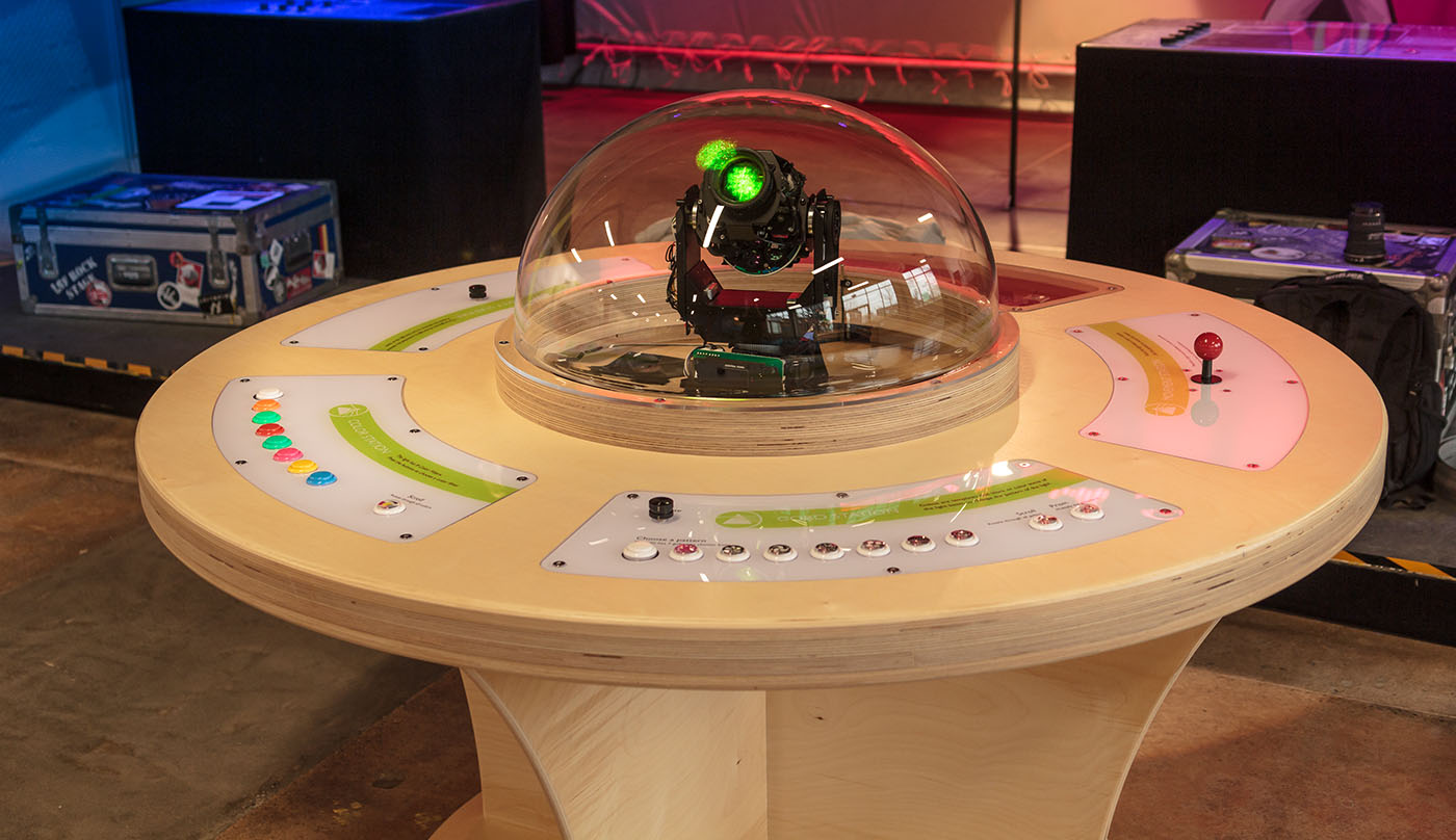
The idea was to split up the fixture’s controls so multiple kids could use the exhibit at the same time. This resulted in a circular design with several stations grouping like controls together. A big part of these lighting fixtures is their ability to move around. To demonstrate this, one station has a joystick, and four colored target circles were hung from the ceiling. Being colored, they also provide a chance to test out color mixing by say pointing a yellow light onto a blue target and seeing green reflected back.
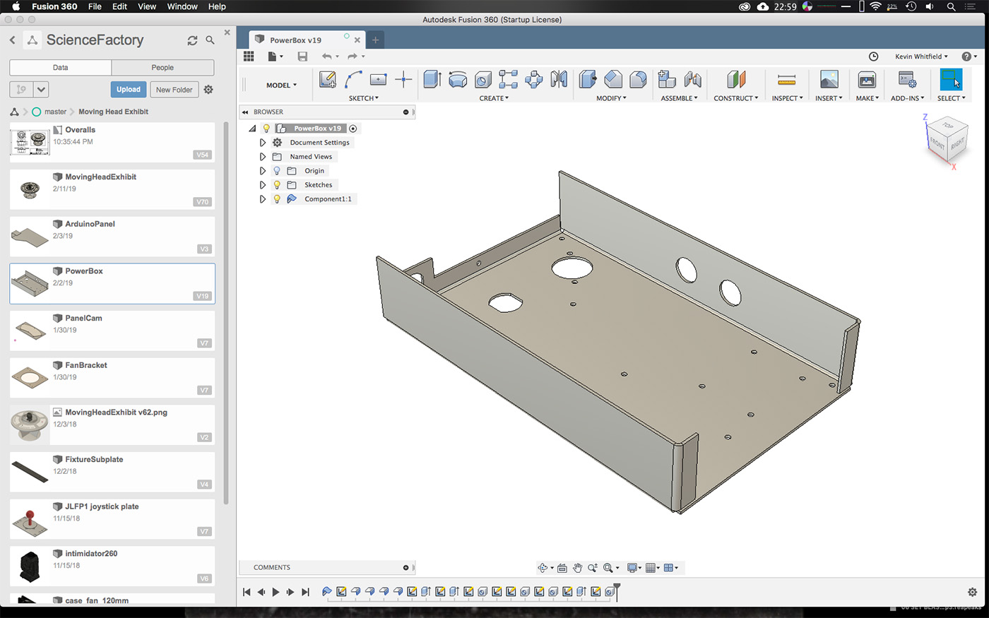
Design started with some napkin sketches, and then moved on to simple previs renderings. All mechanical design was done in Fusion 360, and graphics were prepared in Illustrator. The Science Factory wrote copy, and supplied a style guide, so graphic preparation was easy. Museums, especially the interactive ones, put exhibits in extremely harsh conditions – thousands of children! This meant the design had to be extremely robust, and easy to service. In addition, it had to meet all of the exhibit build guidelines, and my own personal quality standards.
I stated out using as few parts as possible. All screws that would be removed for service were metal-to-metal fasteners. All parts were made as standard and generic as possible to facilitate repair and replacement. Quality arcade hardware was used for the human interface, and many spares were included. I knew I’d have access to cnc machines, so I used slots and keyed holes to help align and strengthen the design. Some parts such as the large rings were split into segments so they could be nested better on the cnc.
The electronics were simple, but still had to be failsafe. I used a thermostat to monitor the temperature in the dome and ensure the main power would be shut off if it rose too high. Dual fans for redundancy. If any of the fuses blow, the fixture will shut off. The logic side is handled by an Arduino mega for simplicity and replaceability. Next to that was installed a master brightness knob to allow the staff to fine-tune the output and ensure everyone was happy.
Construction
To supply the parts and actually build the exhibit, I relied on the generous donations of Tait Towers, ATOMIC, and Nimblist. Tait handled the supply and cnc routing of the plywood. Atomic printed all the graphics, cnc cut the control surfaces, and made the hanging targets. I handled procurement of all other parts, remaining fabrication, and assembly.
The first step was to inspect the parts made by 3rd parties and make whatever modifications were necessary to match the design. After that, assembly of the base began. Some parts I fabricated myself such as the electrical box, fixture and fan attachment plates. Other parts like the control surfaces needed to be milled to size on my cnc, as they were supplied too large.
Programming for the Arduino was done in C++ as usual, with the aim of making it as simple and easy to read as possible. The exhibit uses software to de-bounce the buttons with a sliding window. There is a global off timer so the exhibit will sleep when not being used. All knobs have activation thresholds and dead bands to make using them easier. The exhibit also remembers its last state when waking from sleep.

Install
Surprisingly there were no issues during final assembly and install. I had forced myself to fully assemble it in my shop without leaving anything to chance, and I think that paid off. There was a nice symmetry with being responsible for design, build, and install. I was well aware that my decisions early on would have direct impact on me and any helpers later down the line. This was also a great learning experience as I directly felt the effects of my design decisions.

Feedback
Within the first few days, a button got stuck down causing the color to always be white. I was able to very quickly change it out. Reports from the staff were quite positive. Children seemed to understand how to use it very quickly, and without reading any of the signs. From here on will be the long road of endurance testing. I’m quite interested in seeing what fails, how it fails, and learning from that to improve my understanding and design skills.


