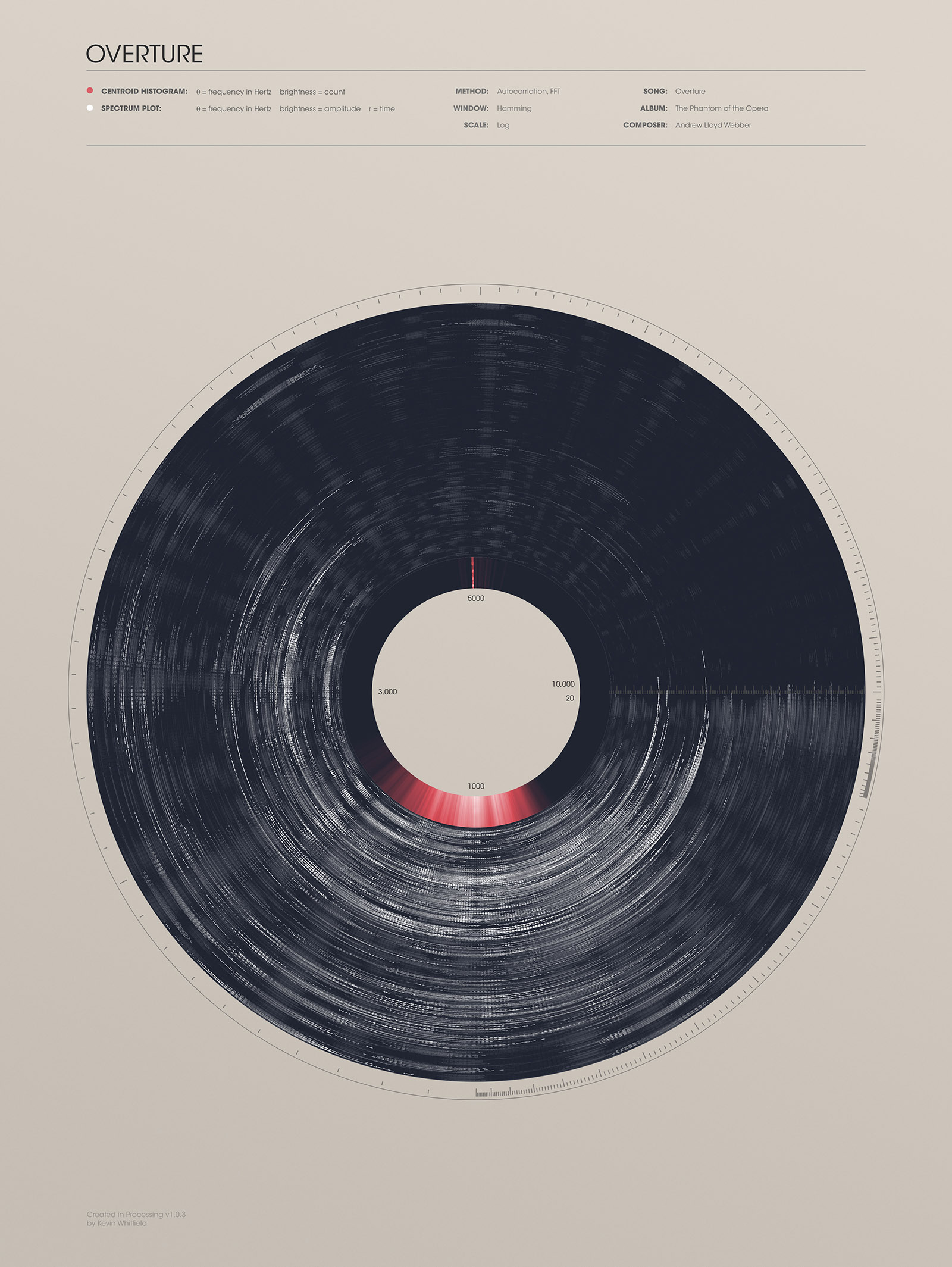
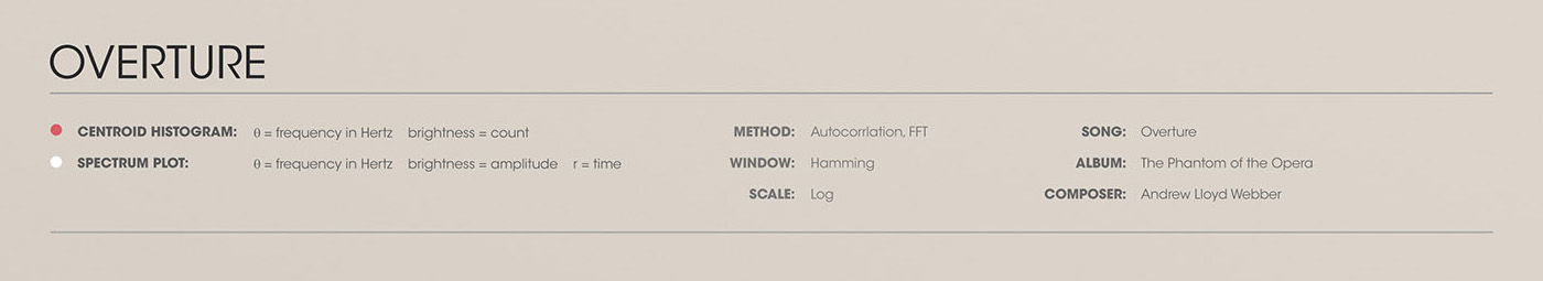
Overture

Sound waves
Data visualization project I did in school. I had always wanted to create a way to visualize entire songs in a way that would reflect their mood, meter, emotion, and texture. I don't think I succeeded, but the results still looked pretty neat.
I used processing to read a sound file and create a circular frequency plot that looked like a record. I then designed a poster around it. The pitch of the sound goes from low to high clockwise, and the time in the song goes from the inside to outside.
The red lines in the middle are a histogram that shows where the most prominent frequencies are.

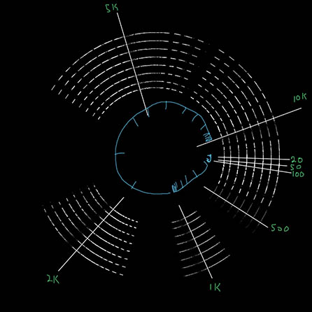
Inspiration

Alternate Style